Merdeka UI
The design system and documentation site for Merdeka's backoffice.
Case study · Design systems designer · August 8, 2026 · 1 min read
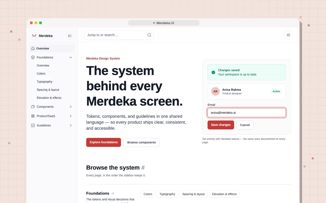
Merdeka UI is the proposed design system for Merdeka's backoffice: colors, type, spacing, components, and rules, documented in one site the whole team can open.
The problem
The system lived in Figma. Engineers needed the same answers next to their code, and AI coding agents can't read Figma at all. Copying values by hand meant the two would drift apart.
What I did
- One spec as the source. Every token comes from a single design spec. A test fails if the code's colors don't match it.
- Generated, not hand-written. Color swatches, the sidebar, and page links are built from the token and navigation files, so they never go out of date.
- 47 pages. Foundations (color, type, spacing, elevation), 25 components, 9 product patterns like tables and modals, and guidelines for accessibility and responsive layouts.
- Readable by agents. The build also writes a JSON file of every token, component, and rule, so an agent knows which button to use and why.
- Easy to use. Search across every page, a dark theme, and animated component previews.
The backoffice prototype later moved onto these tokens. Built with plain HTML and Tailwind CSS, no framework.