redBus redesign
A concept redesign of the redBus bus ticketing app, from user research to a simpler sign-in and search.
Case study · UX researcher and UI designer · May 13, 2022 · 2 min read
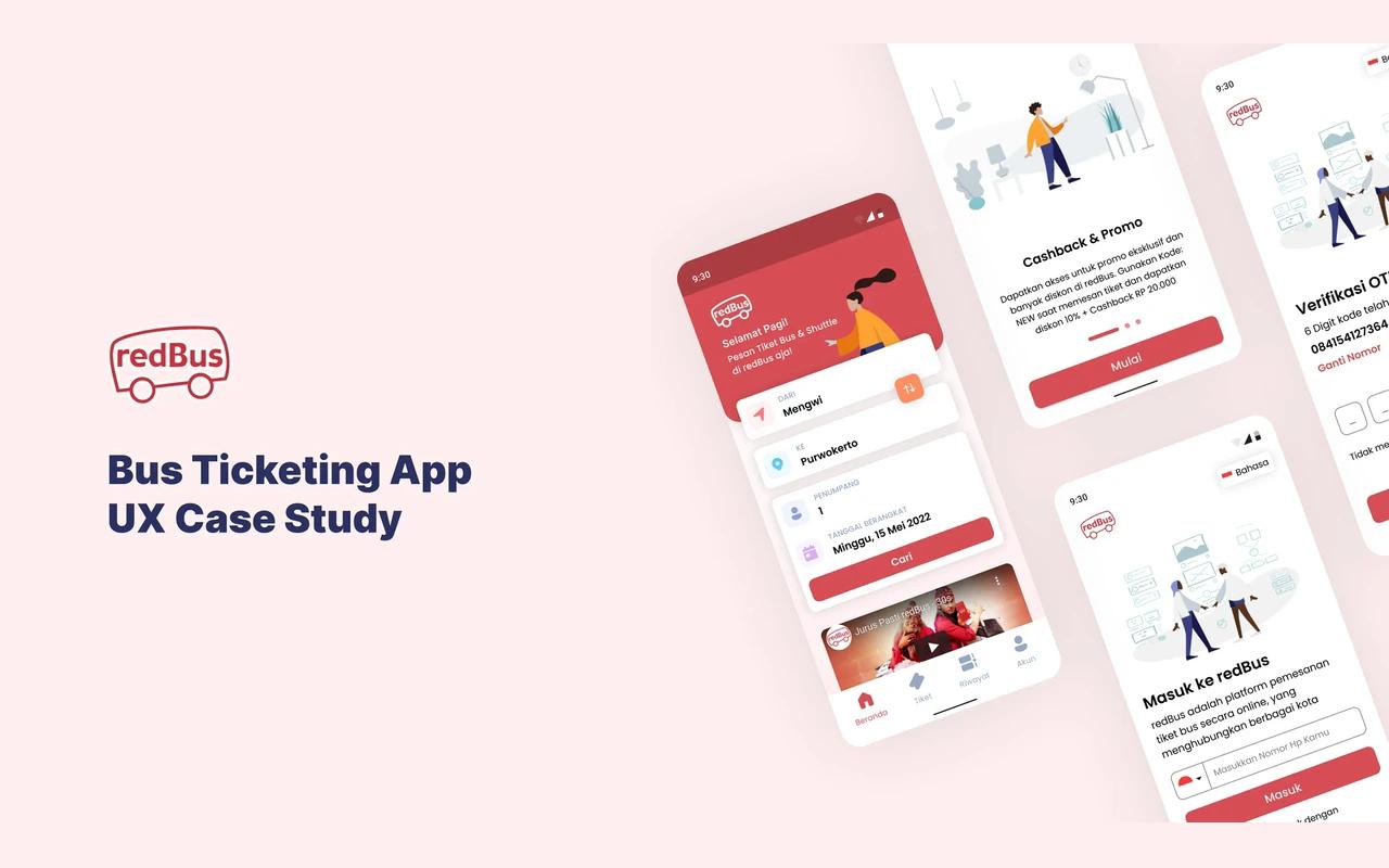
redBus is an app for booking bus tickets in Indonesia. Over five days in May 2022, as an assignment at Binar Academy, I looked at where its users struggle and redesigned the first steps: onboarding, sign-in, and searching for a trip. It's a concept, not work for redBus.
Research
I started with what users had already said, then checked it with people:
- Play Store reviews. I read five 1-star reviews and grouped the problems they described.
- Interviews. I talked to three people who use a similar app, and asked them to try redBus.
- Benchmark. I compared redBus's features and screens with similar ticketing apps.
What I found
Five pain points came out of it:
- The promo on the splash screen is easy to miss.
- A separate country and language screen adds a step before you can do anything. It could live on the sign-in or settings page.
- Labels are inconsistent: some buttons are in English on an Indonesian screen, and some are in all caps.
- The illustration on the verification screen doesn't say what it's for.
- A newer ticket type on the home screen is easy to overlook. It could be its own section.
I placed each one on a matrix of value to users against how feasible the fix was, and used it to decide what to redesign first.
What I changed
- The promo moved into onboarding. The cashback offer and its code now sit on an onboarding card you actually read.
- Language on the sign-in screen. No separate step: a language switch sits in the corner of the sign-in screen.
- Sign-in that explains itself. One line says what redBus is, then a phone number field, with Google and Facebook below. A one-time code confirms the number.
- A simpler search. From, to, passengers, and date in one card on the home screen, with results you can filter.
- Consistent words. Indonesian throughout, with the same capitalization on every button.
Designed in Figma. The full case study is on Behance, and the prototype is on Figma.