GoKids
A parenting education app designed by a team of nine at Binar Academy and tested with five people.
Case study · Product designer · July 1, 2022 · 2 min read
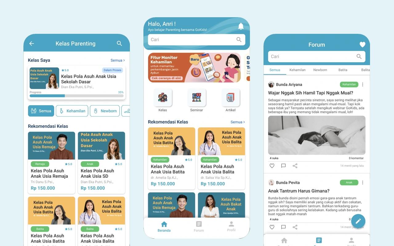
GoKids is a concept app for learning to be a parent: video classes and seminars with experts, articles, and a forum where parents share what they're going through. It was our team's final project at Binar Academy in 2022: nine people, about a month.
The problem
Of the five people in our research, four said young people aren't ready to be parents in terms of knowledge, three learned parenting by watching their family and people around them, and only one had ever found and used a parenting app. We aimed the app at Gen Z and millennials, aged 19 to 40.
What I did
The team split the work from research to testing. My part:
- Flows and wireframes. The flowcharts and wireframes for the app's main paths.
- UI and prototype. High-fidelity screens and the clickable Figma prototype for sign-up, classes, seminars, articles, and the forum.
- Usability testing. Sessions with five people, interviews after each one, and the write-up of what worked and what didn't.
The app
- Classes. Video courses by stage, from pregnancy to the teenage years, with a quiz and a rating at the end.
- Seminars. Sessions with experts, paid by virtual account, with the ticket saved in the app.
- Articles. Short reads on parenting that you can like and share.
- Forum. Parents post by topic, like pregnancy or newborns, and reply to each other.
Testing
Five people tested it: aged 15 to 40, interested in parenting, married or not. Each did five tasks: sign up, buy a class and rate it, book a seminar, read and share an article, and post in the forum. Then we talked through each session in depth.
21 of the 25 tasks went smoothly. The four that didn't were in sign-up, buying a class, and booking a seminar (twice). What people struggled with:
- Sign-up. After registering, they had to sign in again instead of going straight in.
- Classes. The class covers looked alike, payment was confusing, the quiz was hard to find, and free classes weren't marked.
- Seminars. After paying, they couldn't find their ticket.
- Articles. The body text was small and set too tight.
People also asked for private chat with other parents and for consultations with experts. These went into the report as recommendations; the project ended before another round.
Designed in Figma. The prototype is on Figma.